Anything can be a course. Finishing it is the design problem.
LearnPiq writes you a real course on any topic you can name. That part is the demo. The product is everything built to get you back tomorrow, and the day after that.
Two mature categories, and nothing standing in the overlap.
AI course generators can write about anything, and people abandon them in a week. The retention loop that actually works, streaks and hearts and leagues, has been proven on hundreds of millions of people, and it only teaches languages.
I did not want to make a fourth product that writes lessons. I wanted the loop, pointed at any subject. Which means the interesting work is not the generator, it is everything that has to be true on day four: a path you can see yourself progressing along, a cost to being careless, a reason to open the app before midnight, and content that survives being read on a phone in a queue.
Where the gap was
LearnPiq
Generator apps
The language app
Any topic, no catalogue
Yes
Yes
No
You choose the depth
Yes
Fixed length
No
Spaced repetition
Yes
No
Yes
Hearts, streaks, leagues
Yes
Partial
Yes
Offline
Yes
No
Yes
Native iOS
Yes
Mostly web
Yes
Drawn from the competitive pass I ran before writing any code. The column that matters is not the row count, it is that no product had both halves.
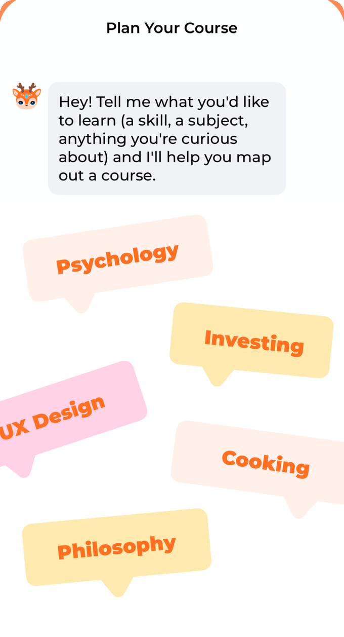
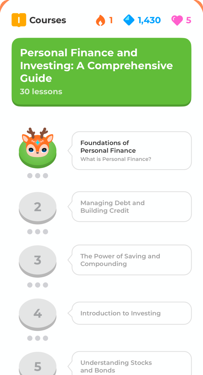
Planning is a conversation, not a form.The output is a path you can see the end of.Lessons carry diagrams and video, not just text.
The reframe
Generating the course is the demo. Coming back on day four is the product.
— the sentence I used to settle every argument about scope
02
Thirty features, one order. The order was the plan.
I wrote the full feature set down first, then sorted it by a single question: if this is missing, is the app broken, boring, or merely smaller?
11 P0 — broken without it
The loop itself: plan, generate, read, answer, earn, come back. If any one of these is faked there is nothing to judge, so this tier got built first and got judged on a real device before the rest existed.
12 P1 — boring without it
Hearts, leagues, daily goals, spaced repetition, achievements, onboarding, subscription. The app works without them and nobody returns. Shipped before launch, deliberately not before P0.
7 P2 — smaller without it
Audio lessons, widgets, Watch, Siri, sharing, A/B tests. Every one is a good idea, and every one is a guess until real users exist. Explicitly deferred, not forgotten.
And a sequencing bet: no backend until phase three
P0Skeleton and design system
P1Core learning loop, all local
P2Gamification and onboarding, all local
P3Backend, auth, sync
P4Subscription and offline
P5Store submission
P6Post-launch
On-device only, no server exists yetServer
Three phases of product ran with no backend at all, on local persistence and a device-side API key. That is not laziness, it is the cheapest way to avoid rebuilding a schema: I got the interactions wrong several times on a real device, where wrong is free, instead of getting them wrong after a table had been designed around them.
The thing that made it survivable was defining every data access as a protocol on day one and writing a local implementation behind it. When the real backend landed, the screens and view models above it changed nothing. The seam was designed before it was needed.
03
Seven decisions, and what each one cost.
Every one of these trades something real away. Writing down what I gave up is the only way to tell a decision from a preference.
D1
A conversation instead of a setup form
Traded away
Speed for the person who knows exactly what they want, and a tidy settings screen with depth and difficulty pickers.
What it bought
People who cannot name what they want still get a syllabus. "I want to learn UX" is a valid starting point instead of an error.
Constraints written into the planner, not left to the model
Never ask the user to pick an enum. Depth and difficulty are inferred from how they talk about the subject.Converge in five turns or fewer. An outline must appear; endless clarifying questions are a failure state.Always offer tappable options. The cost of answering should be one tap, not a paragraph.Follow the user's language. Ask in Chinese, get a Chinese course.
The picked-out topics on the empty state exist for the same reason: a blank chat box is a worse prompt than five buttons.
D2
Publish lesson one, write the rest behind it
Traded away
The clean mental model of a finished course. A path can now be real at the top and still being written further down.
What it bought
Time to first lesson is one lesson, not thirty. Nobody waits on a progress bar for a course they have not decided they want.
Lesson 1 · you start reading hereLessons 2 to 30 · written while you read
The same decision solved a second problem: a free course pauses here rather than failing, and the upgrade prompt lands after the first lesson is finished, at the one moment the value has been demonstrated instead of promised.
Paused is a first-class generation state alongside pending, generating, completed and failed. It is a product state, not an error, which is why subscribing resumes every paused course automatically instead of asking the user to go and find them.
D3
The course palette is the brand palette, and no human picks it
Traded away
Art direction per course. Two unrelated courses can land on the same green, and I cannot overrule it.
What it bought
Every user-generated course gets an identity with no designer present, no server call, and nothing stored. The same course is the same colour on every device, forever, offline.
Five themes, each a face and a side. The side only ever means depth.
Brand, buttons, streak
Info, gems
Correct
Hearts
Accent, in progress
Locked
Press one. The colour never changes; the face drops onto its side layer. A course picks its theme from four bytes of its own identifier, so the choice is deterministic and needs nobody's permission. Five themes doubling as the functional palette is the reason the app has no separate brand colour to maintain.
D4
Nothing looks graded before you submit, and no verdict is colour alone
Traded away
The instant satisfaction of an option turning green the moment you tap it, and a lot of visual variety across five exercise types.
What it bought
Selecting and being right are never confused. Every verdict is a tint plus a border plus an icon, so it survives colour blindness and a bright pavement.
The state matrix, rendered here with the app's real tokens
Managing your money through daily decisionsDefault
Managing your money through daily decisionsSelected, pre-submit
Managing your money through daily decisionsCorrect
Investing in stocks to build wealthIncorrect
Managing your money through daily decisionsReveal, not chosen
One matrix, obeyed by multiple choice, true or false, matching and ordering. Writing it once as a table is what stopped the five exercise types from drifting into five dialects of feedback.
D5
Gems can only buy things that cost nothing to give
Traded away
A gem sink users loved: spending the currency you earn from streaks on new lessons. I built it, shipped the design, then deleted it.
What it bought
An economy that cannot be arbitraged. Gems now buy a heart refill and a streak freeze, and nothing else.
Two things were wrong with it and they compounded. Larger gem packs are cheaper per gem, so any discount landed entirely on the one item that costs real work to produce. And gems are handed out for streaks and finished courses, which means a currency I give away was convertible into work I have to pay for. The fix was not a better exchange rate, it was a rule: a currency users can earn for free may only ever buy things that are free to grant.
XP 4451,43057
What survived: five hearts, one back every hour, refillable with gems. A streak freeze, also gems. Both cost nothing to hand out, so both can be won.
D6
The client may display an allowance. It may never decide one
Traded away
Instant local answers. The app has to ask the server what it is allowed to do, and handle being told no.
What it bought
A modified client cannot grant itself anything. Balances, hearts, league results and settlement columns are all server-owned; client writes get pinned back.
The refusal order is a design decision, not an implementation detail. It draws from the monthly allowance first, then anything purchased, then the one free trial, and only then from a reserve. The reserve cannot open a new course, ever: it exists so that a subscription lapsing does not leave a half-written course stranded at lesson fourteen. And the purchase verifier deliberately skips the tier check, because by then Apple has already taken the money, and refusing to deliver would not be validation, it would be theft.
Same instinct one layer down: hearts recover on elapsed time, so the server rejects a recovery timestamp that sits in the future rather than rewarding a device with a rewound clock. Purchases are row-locked so a double tap cannot double spend.
D7
A quiet league promotes nobody, and the week is UTC
Traded away
A weekly result for every user from day one, and a week that begins when the user's own calendar says it does.
What it bought
A competition that is not humiliating at small scale, and one global week that cannot be split into three by timezones.
A new app has thin leagues. Coming third of three is not a defeat, so under ten active people the whole group holds: nobody is promoted, nobody is relegated, no prizes go out. Above that, top five rise and bottom three fall.
The week boundary looks like a detail and is not. The device calendar's first weekday changes by region, and local midnight is a different instant in every timezone, so using it would shear one natural week into two or three competing weeks. One UTC week, decided in a single place, and settlement is idempotent so a missed run heals itself next week instead of paying prizes twice.
5hearts, one back every hour
300daily XP ceiling, so grinding has a floor and a roof
15achievements at launch, all reachable
5league tiers, isolated so diamond never meets bronze
04
I ran an evaluation to swap the writing model. It found four defects in my own brief instead.
The question was simple: can the model that writes lessons be replaced. Answering it honestly needed a harness, and the harness is what found the real problem.
Four models, eight fixtures chosen for structural variety rather than topic coverage, every sample scored against what the app actually does rather than against what the brief says it should do. Those two disagree in places, and where they disagree, production wins.
Then the signal: all four models failed the same structural checks. When every writer fails the same way, the writers are not the variable. The brief is.
The renderer paginates a lesson every seven blocks. The brief never said the word "page".
The app splits long lessons across pages at a fixed block count. That constraint lived in the parser and nowhere in the instructions, so models wrote lessons that were then chopped in places nobody chose. Largest single failure in the run.
42 of 96 samples
A required closing line appeared zero times in the system prompt.
Every lesson has to end with a specific hand-off into the exercise. That requirement survived only as a trailing clause in the per-request prompt, absent from all 12,260 characters of the system prompt that was supposed to define the format.
0 occurrences
Two rules in the wrong order produced dead interface.
The instruction to highlight key terms came before the instruction to define them, so models highlighted terms they never defined. The app renders a highlighted term as tappable text that opens its definition. No definition means a tap that does nothing, which reads as a broken app rather than a bad lesson.
Prompt ordering
The brief banned em dashes while using twenty-one of them.
Including one inside a worked example held up as correct. An instruction that contradicts its own demonstration is not an instruction.
21 violations, self-inflicted
Before the fixes0.29
After the fixes0.50
Structural pass rate on the baseline model. Every other model improved too, which is the evidence that the brief was the cause rather than one model's weakness. Same models, same fixtures, better instructions.
The rule, written before the numbers
Six conditions, all of them, or you are not a candidate
Pass rate above a floor with the interval accounted for, zero hard-gate failures, no non-English search queries leaking through, a judge win rate above a floor, judge self-agreement high enough to be usable at all, and an API failure rate under five percent. Written down in advance precisely so I could not soften one after seeing a result I liked. No qualifying candidate means the incumbent wins and nothing changes.
The read, protected from the machine
Blind, shuffled, and rated before anything is revealed
Four versions of each lesson side by side, rendered the way the app renders them, model names replaced by colour words, column order reshuffled per fixture from a recorded seed so it is reproducible but not learnable. Both the model names and the automatic scores are hidden behind a button, because seeing either one first turns an independent judgement into agreement with a machine.
And the outcome was to change nothing
The newer model wrote better lessons. The automated judge preferred it six pairs to two and scored it higher on all seven dimensions, and my own blind read agreed. It still lost, on two axes that are not writing quality: cost per usable lesson, and latency.
Incumbent22.6s
Better writer55.7s
95th percentile time to write one lesson. A learner watches a generating screen while this happens, so latency here is a product cost, not only a bill. Two and a half times the wait, for a quality difference nobody reported noticing, is the wrong trade for the person holding the phone.
Reported honestly
Twenty-four samples cannot choose, only reject
At that sample size the confidence interval is seventeen to twenty points wide, so 0.79 against 0.71 is not a difference. Every rate prints with its interval and overlapping intervals print INCONCLUSIVE instead of a winner. Every judged pair is judged twice with the columns swapped, and only a verdict that survives the swap counts.
Still open
0.50 does not generalise, and I said so
Pagination is still the top remaining failure after the fix, and three subject categories the matrix never covered went nought for three in the follow-up sweep. The harness re-scores old runs for free, so raising the bar costs nothing but the decision to do it. The number is a floor with a date on it, not an achievement.
05
A design system tight enough that generated content cannot break it.
Every lesson in this app is written by a model I do not fully control. That is only survivable if the surface it lands on has no room for interpretation. This page is built from the same tokens.
Exactly three opacity steps. No fourth one exists.
0.15Badge capsules, status circles, matched tiles, ring tracks
0.2Borders, empty tracks, the glow behind a finished node
Three steps instead of a tonal scale, because a tonal scale is a decision to make on every screen and three named steps is a decision made once. Every tint on this page is one of these three.
Depth is physical, and it is never colour.
0.08s ease-in-out
Face on a darker side layer, and pressing collapses the face onto the side in 0.08 seconds. Nothing dims, nothing tints, nothing scales. In the app each of these also fires a specific haptic, which is the half of the interaction a case study cannot show you.
The rules I refused to bend
from the system's don't list
No pure black. The darkest colour in the app is a soft charcoal, on every surface.No card shadows. One exception, the result card, and it is documented as an exception.Green only ever means correct. Pink only ever means hearts. A colour with two jobs has none.No side colour as a fill. The darker half of a pair is depth, never decoration.No press communicated by colour. Physical collapse or nothing.No invented spacing or opacity. Four point grid, three tints, named radii, or it does not ship.No system font for a changing number. Every XP, streak and gem count is set in the display face.No dark mode. Light only, on purpose: a half-tested second palette is worse than one good one.
Written as a do and don't list next to the components, so the answer to "can I just" is already on the page. This is also what let a solo project build 172 files of interface without a review to keep it honest.
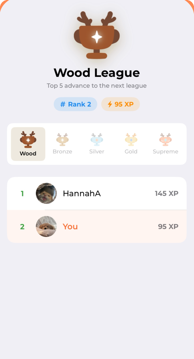
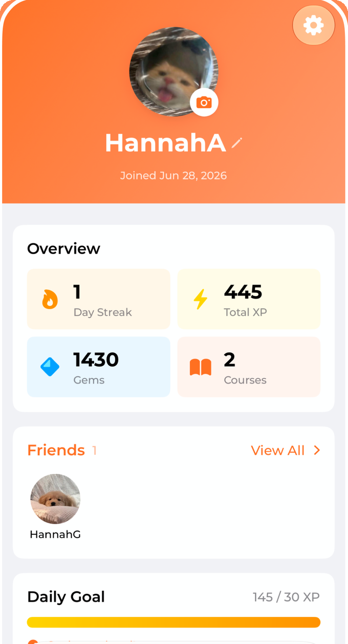
Leagues, with the tier ladder always visible.Progress, in the four numbers that matter.
06
What a deliberate pre-launch audit found.
Before submitting, I went through the app looking for the four categories of thing that a demo never reveals: money, safety, correctness and the bundle itself.
Money — the worst bug in the app
A paying subscriber could sit on the free tier
Apple only notifies a server when a subscription changes. Never on a restore, a reinstall, or a sign-in on a new device. Every one of those users came back as free and hit the exact limit they had paid to remove. The fix gives the client a way to hand over its signed transaction, and the function only ever improves a subscription row, so a replayed old receipt can never resurrect an expired one.
Safety
Filter at the write path, not at the screen
A display name is the only free text one user puts in front of another, so it is screened both on the edit screen and at the single repository write every name has to pass through. Screen-level validation alone is one new entry point away from being bypassed. Report and block already existed but gave no visible confirmation, which made them look broken, and a safety feature that looks broken is a broken safety feature.
Correctness
Force unwraps on model output are a crash with a timer on it
Generated content is untrusted input. Anywhere the app indexed an array or unwrapped a value from a lesson it had not itself written was a crash waiting for an unusual topic. Retries that could not exhaust, and synchronous writes that published state the repository had already rejected, came out in the same pass.
The bundle
Stray Figma exports were shipping inside the app
A resource glob in the project file was sweeping up design exports and a backup file and building them into the shipped binary. Nobody would ever have seen them, which is exactly why nobody would ever have found them. The build configuration is part of the product.
And the lesson I liked least
Redefining a database function replaces its whole body, so anything you leave out disappears without an error. I redefined one against a version I happened to have read rather than the current one, and a global spending ceiling silently vanished.
The fix was easy. The response was the part worth keeping: instead of fixing that one function, I listed every function the migration redefined and checked each one's history against the latest definition. Two of them had the wrong baseline. The second had quietly dropped a field that was the client's only way to learn a refund had cleared a flag, which would have left an upgrade prompt permanently in the way for exactly the users who had been refunded. A field designed for backwards compatibility had disguised a regression as "the server is just older".
One mistake is an oversight. The same mistake twice in one migration is a missing routine, so it became one.
8functions in that migration, every one re-audited
2silent regressions found by the sweep
1.0.1shipped after 1.0, live on the App Store
07
What I would do differently.
01
Write the renderer's constraints into the brief on day one
The pagination rule lived in the parser for weeks while the instructions knew nothing about it. Any hard constraint the interface enforces belongs in the brief the moment it exists, not the moment an evaluation catches it.
02
Instrument the funnel before the store, not after
I can see that people finish lessons. I cannot see which lesson number they stop at, or whether abandonment tracks course length. That one number would decide what I build next, and I shipped without it.
03
Decide the sample size against the decision, not the budget
Twenty-four samples per model was enough to reject candidates and not enough to choose between them. I should have worked out which question I was actually paying to answer before designing the matrix around it.
The claim is that you will still be here on day four.
Which is the sort of claim you can only really check by installing it and seeing whether you come back.
 LearnPiq · Solo product · Live on the App Store

 1,430
1,430 5
5 7
7