I just need icons that feel like they belong to my product, not another generic set.
Josh, independent developer

Creating a custom icon often means choosing between generic libraries, inconsistent AI outputs, or time-consuming manual design.
I designed and built Icovela, an AI-powered platform that helps creators and product teams generate consistent, ready-to-use icons from simple text prompts.
More than 36 million developers joined GitHub in 2025, and 84% of surveyed developers use or plan to use AI tools. Yet inconsistent output remains developers' biggest AI frustration. As building gets faster, creating polished, cohesive visual assets remains a bottleneck.
From product strategy and UX/UI to AI generation, subscriptions, and analytics, I independently built Icovela into a production-ready product. Funnel-driven iterations later increased registered-user activation by 2.6×.
Select from distinct visual styles to shape the icon's look and feel.
Turn a simple text prompt into a custom icon built around your concept.
Create a polished icon in seconds and download it for your project.
I just need icons that feel like they belong to my product, not another generic set.
Josh, independent developer
I began with user interviews and competitive research to understand how creators and independent developers source icons for their products.
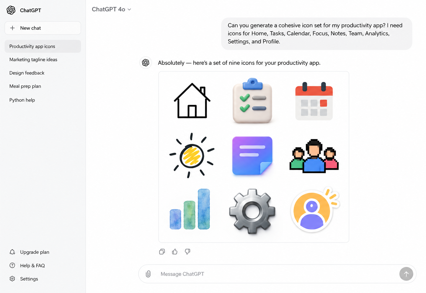
Existing icon libraries were fast but offered limited customization. General-purpose AI tools offered more freedom, but required users to translate visual ideas into complex prompts. This revealed an opportunity for a more focused, approachable icon-generation experience.
make custom icons fast, distinctive, and easy to create?
Based on the research, I defined three principles for the initial product. Every decision that follows was held against them.
Users should be able to begin with a simple idea rather than learning how to write complex prompts.
Visual examples should help users choose a direction before committing to a generation.
The path from landing on the product to generating an icon should feel immediate and easy to understand.
To validate the idea quickly, I focused the MVP on one essential journey. Rather than expanding the initial release with secondary tools, I prioritized a clear path from idea to first icon.
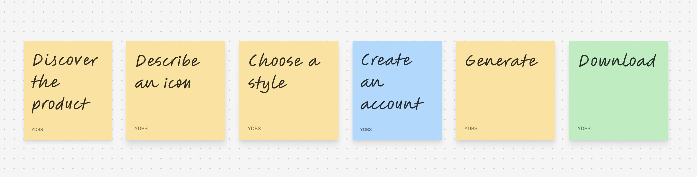
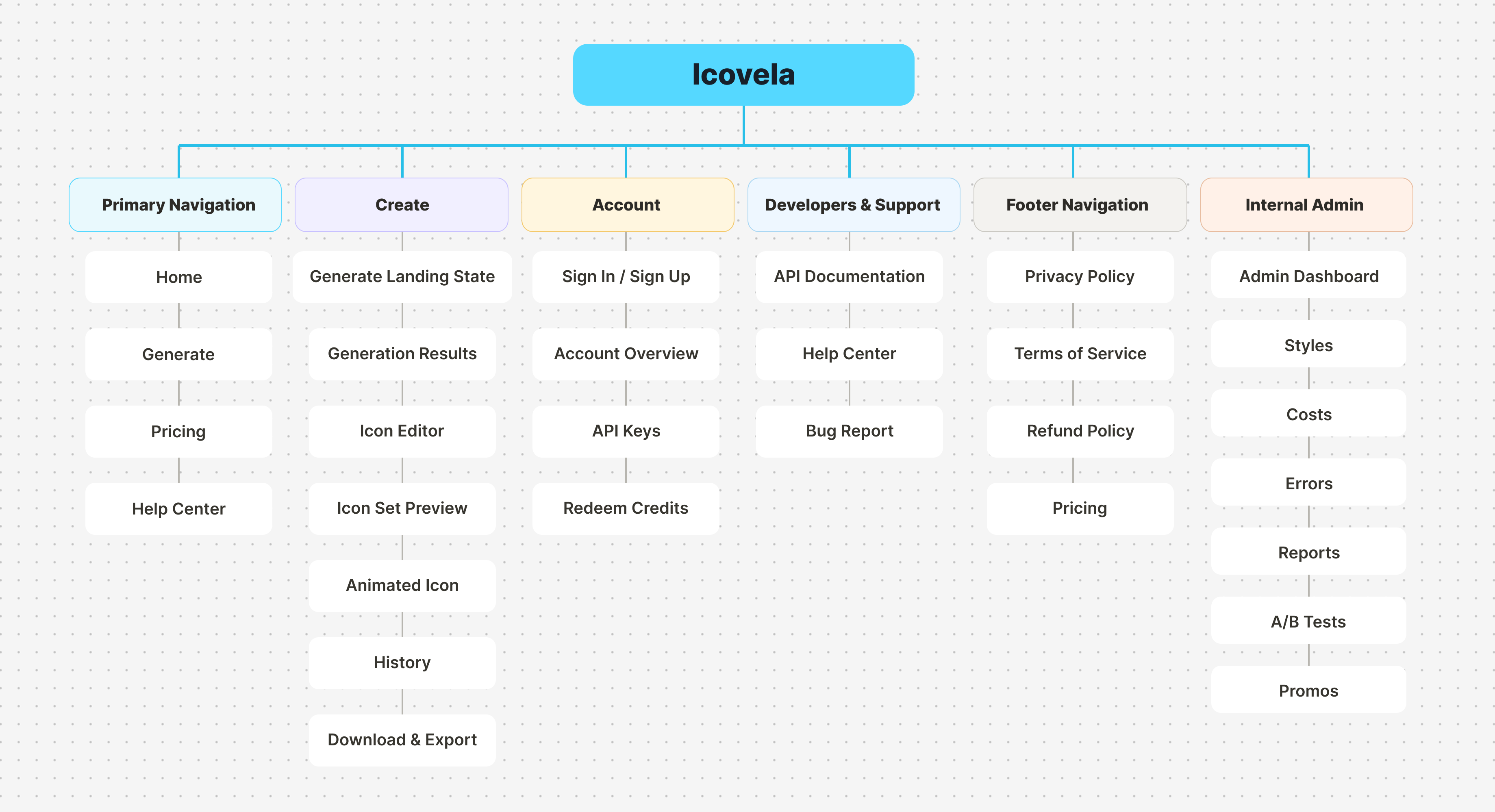
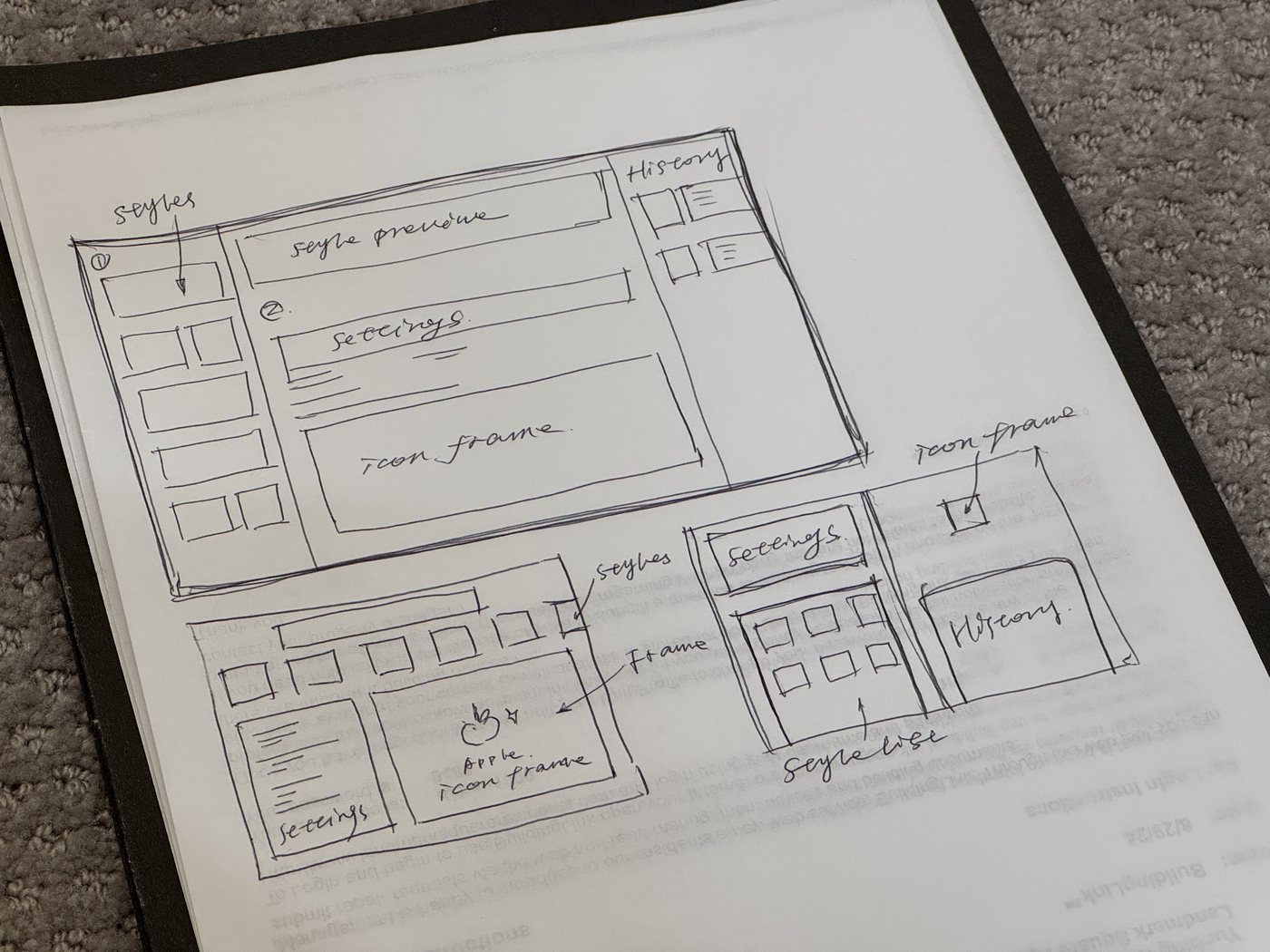
Launch was only the beginning.
The next step was understanding how users moved through the product, and where they dropped off.
To learn from real usage, I instrumented the journey from first visit to download and brought the signals into an admin dashboard.
This allowed me to see not only how many people signed up, but whether they reached the product's first meaningful action.
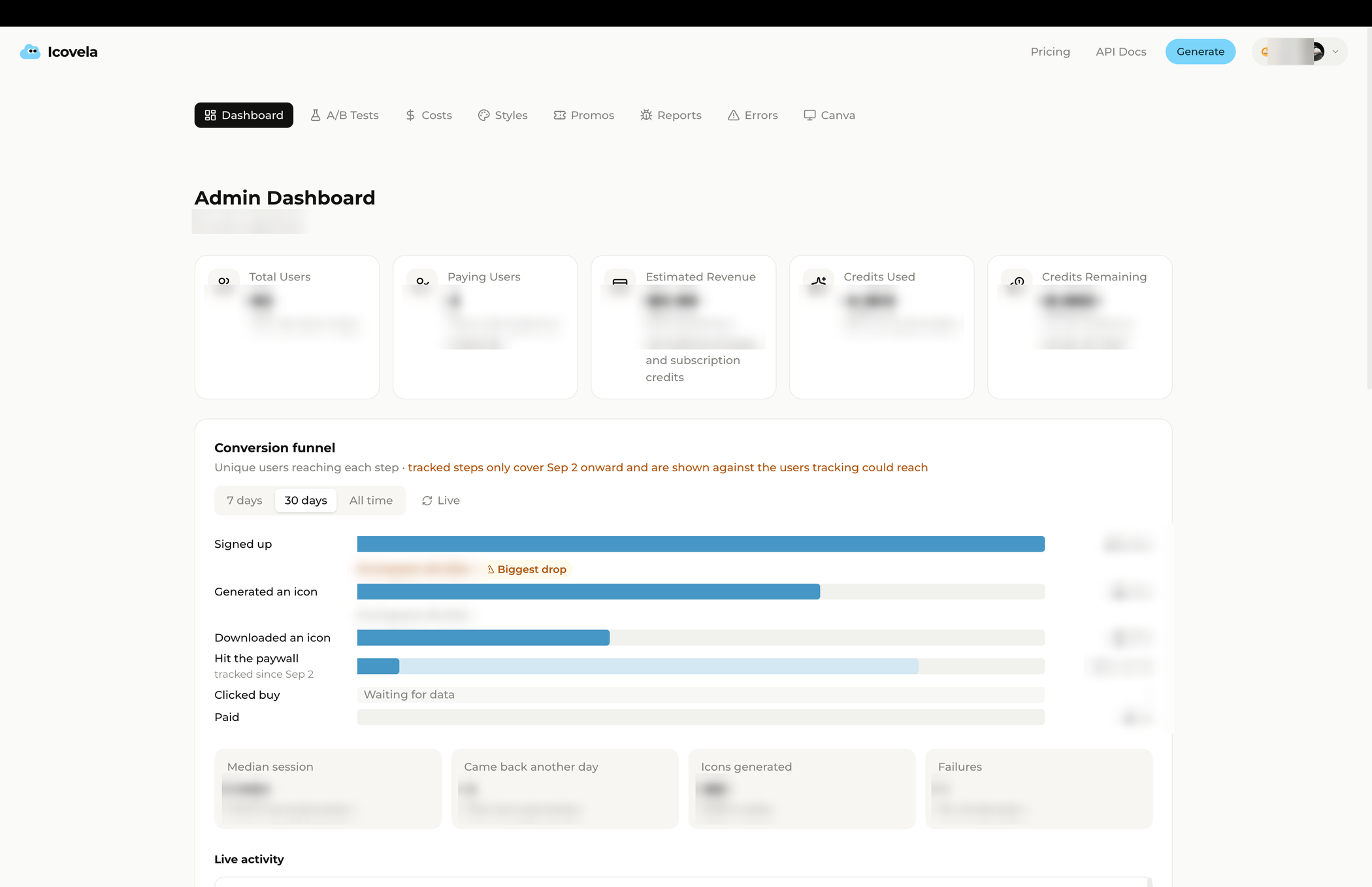
The funnel challenged my assumption.
The product was live, but the funnel revealed that many registered users never reached their first generation. Activation was only 24%.
At that point, adding more generation features was not the priority. The immediate challenge was helping new users experience the existing value.
“How can I make generation more capable?”
“How can I help more users reach their first generation?”
After launch, only 24% of registered users reached their first generation. The funnel showed where users stopped; reviewing the experience and user feedback pointed to two sources of friction.
The offer was present, but visually secondary.
A consistent value message guides users from discovery to sign-up.
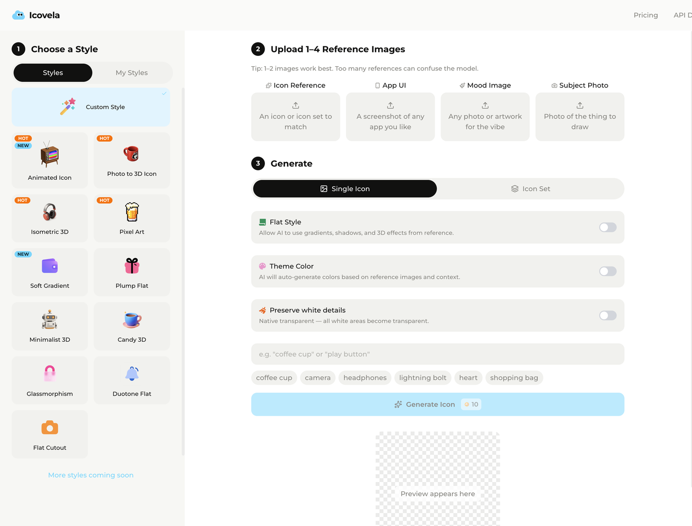
Custom Style was the default, so reference images were required before anyone could generate.
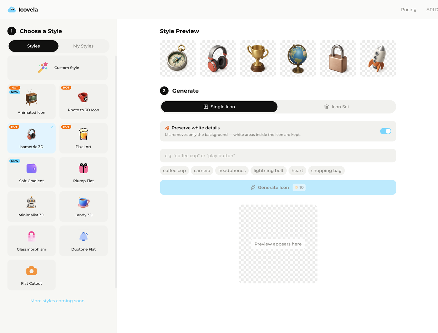
Isometric 3D is the default, so a prompt is all it takes. Custom Style stayed for anyone who wants more control.